Personal Project
PARTICLES – Photo Zine Layout & Editorial Design
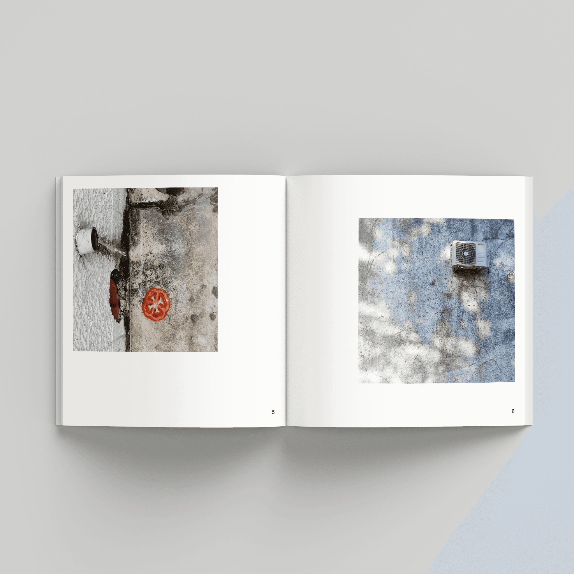
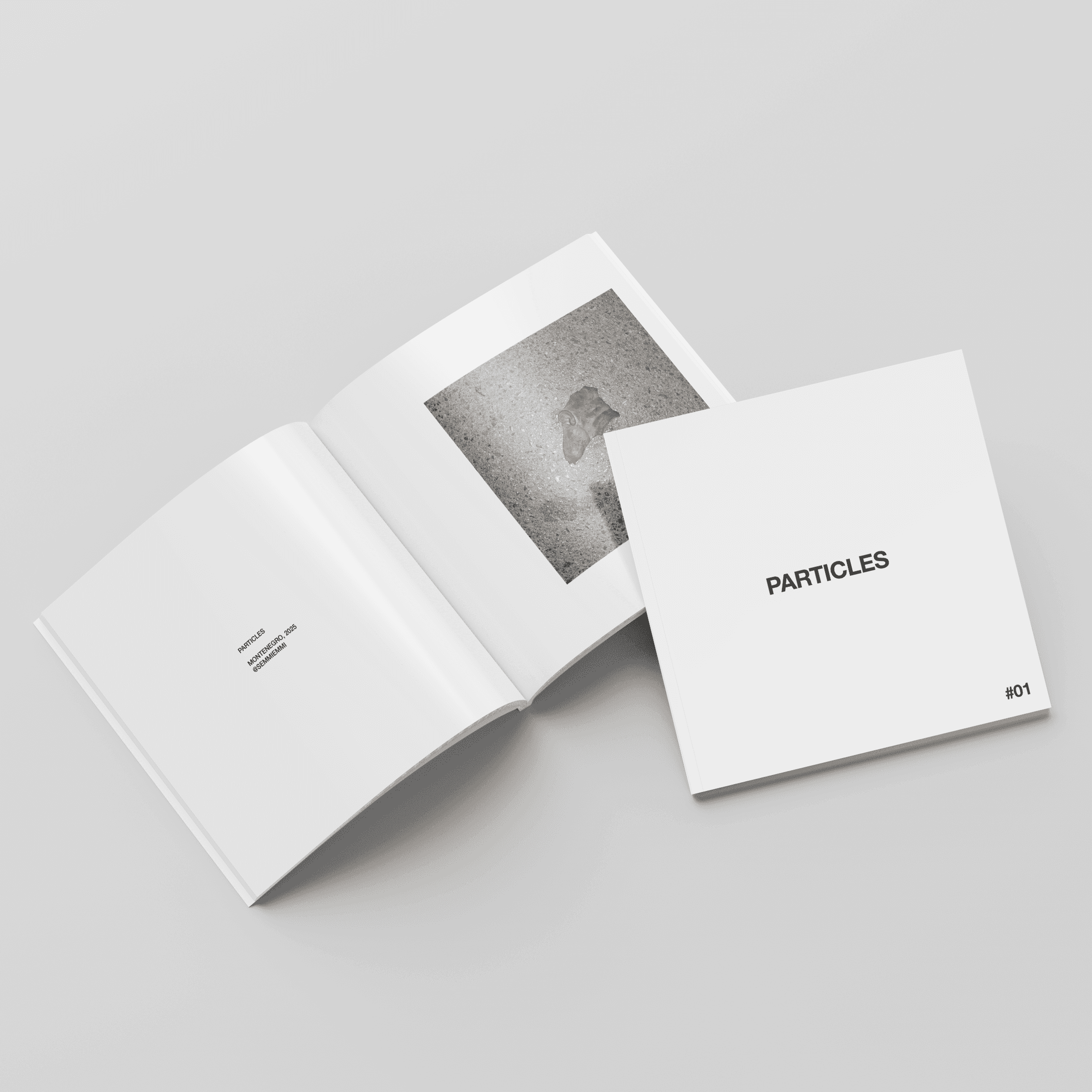
A minimal photo zine created in collaboration with my sister, who documented everyday fragments in urban Montenegro.
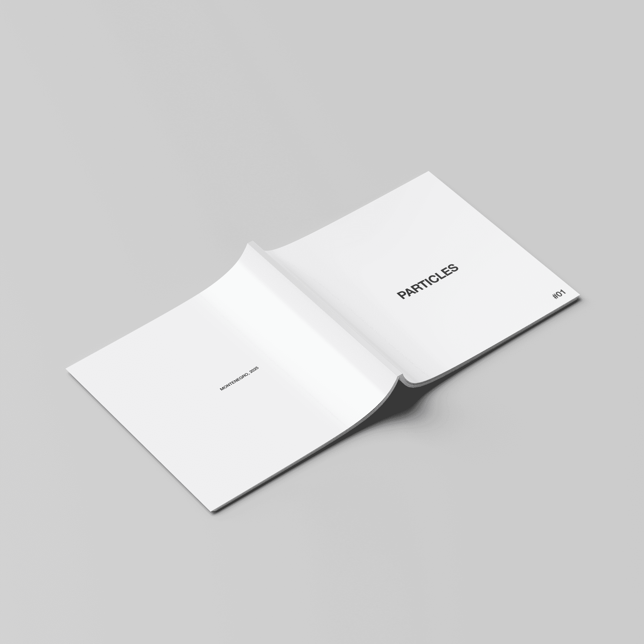
This project explores the unnoticed — small details, quiet textures, and strange objects that usually escape our attention. The goal was to give space and meaning to the overlooked.

I designed the layout to feel calm, clear, and structured. Each image sits in a white frame, supported by simple captions and generous negative space.
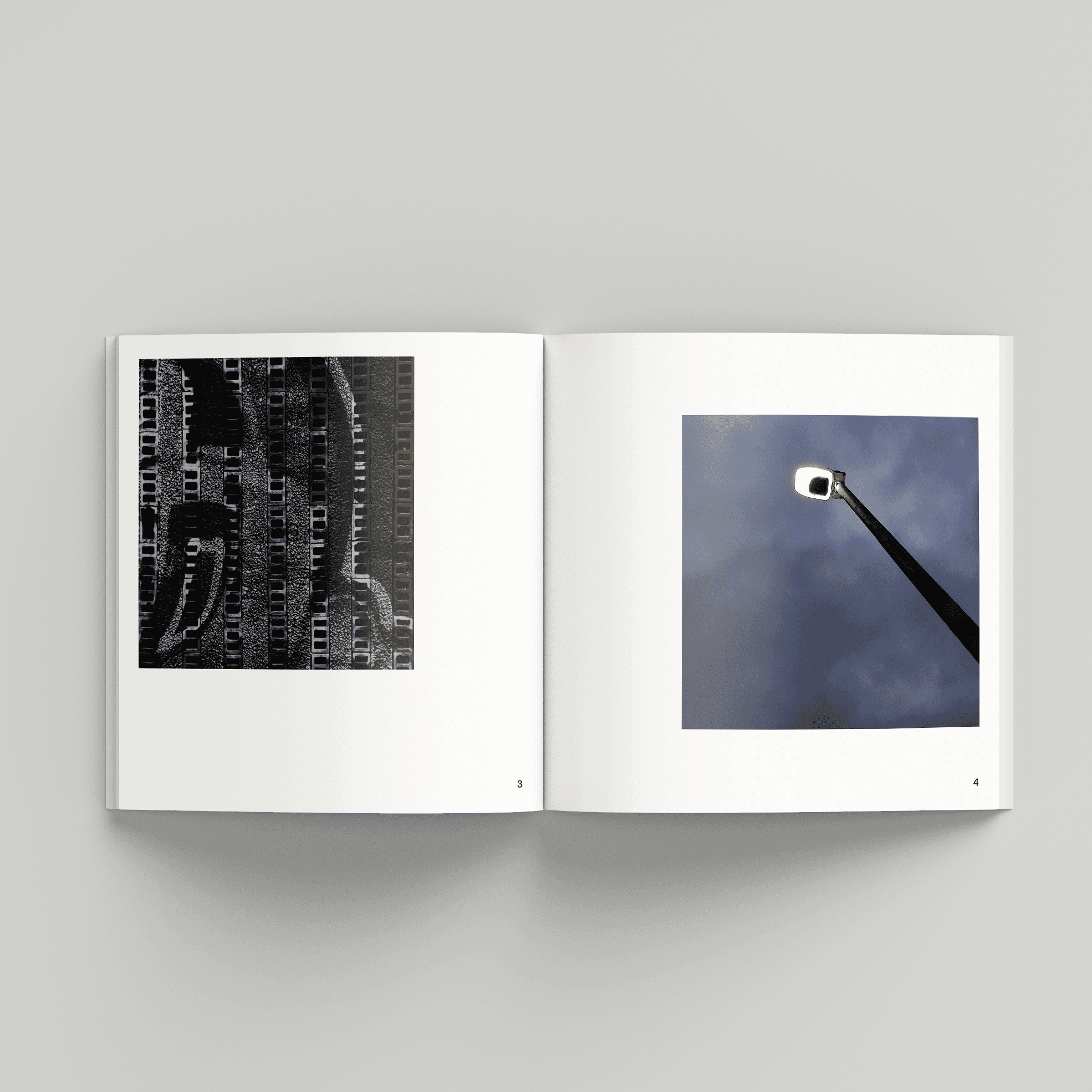
Square format, soft rhythm between full-page and paired spreads
Clean Swiss-style layout with subtle use of Helvetica Neue
Minimal typesetting to let the images lead
Printed mockup design for digital presentation

This project reflects my interest in quiet storytelling, typography, visual rhythm, and the poetic side of editorial design.
PARTICLES – Photo Zine Layout & Editorial Design
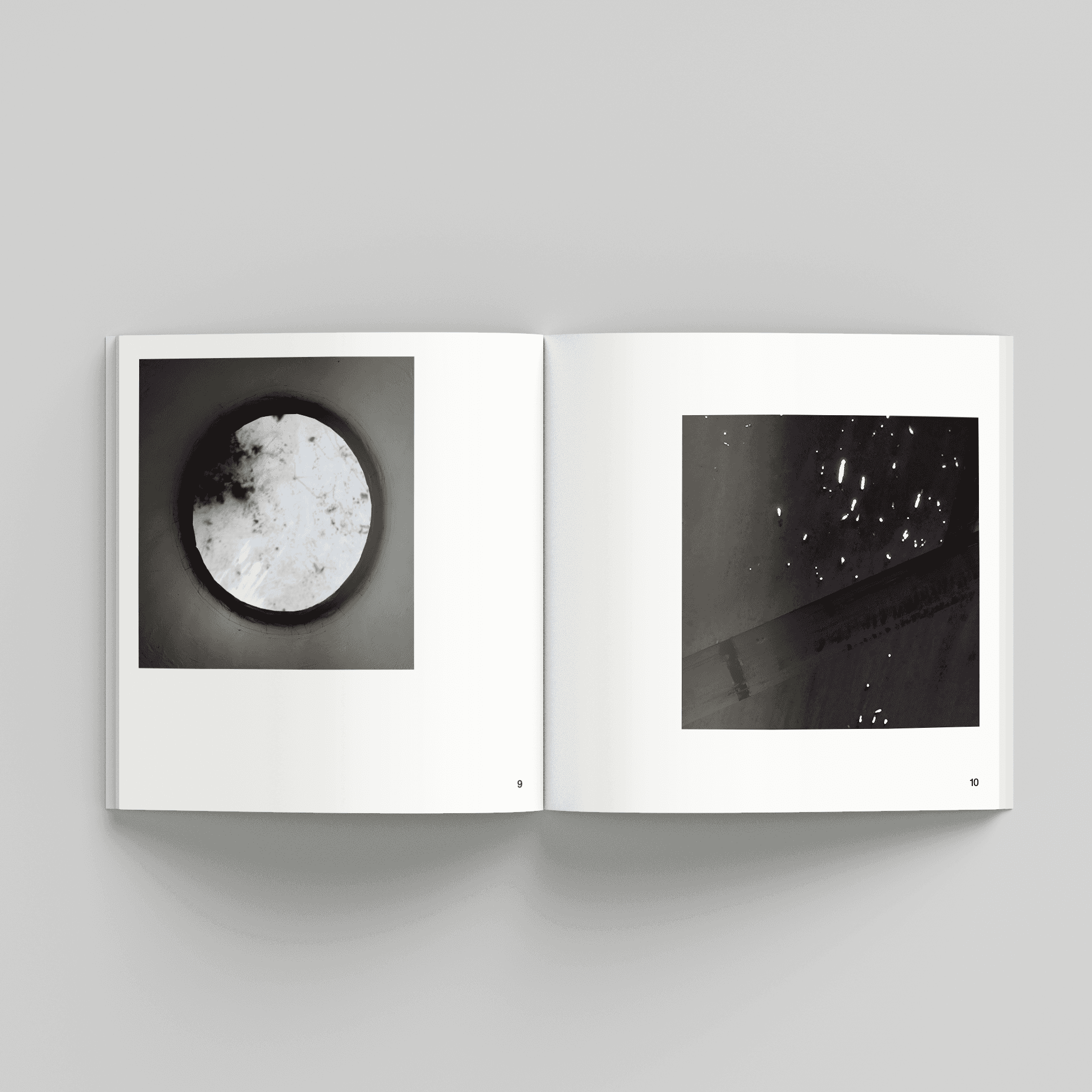
A minimal photo zine created in collaboration with my sister, who documented everyday fragments in urban Montenegro.
This project explores the unnoticed — small details, quiet textures, and strange objects that usually escape our attention. The goal was to give space and meaning to the overlooked.
I designed the layout to feel calm, clear, and structured. Each image sits in a white frame, supported by simple captions and generous negative space.
Square format, soft rhythm between full-page and paired spreads
Clean Swiss-style layout with subtle use of Helvetica Neue
Minimal typesetting to let the images lead
Printed mockup design for digital presentation
This project reflects my interest in quiet storytelling, typography, visual rhythm, and the poetic side of editorial design.
PARTICLES – Photo Zine Layout & Editorial Design
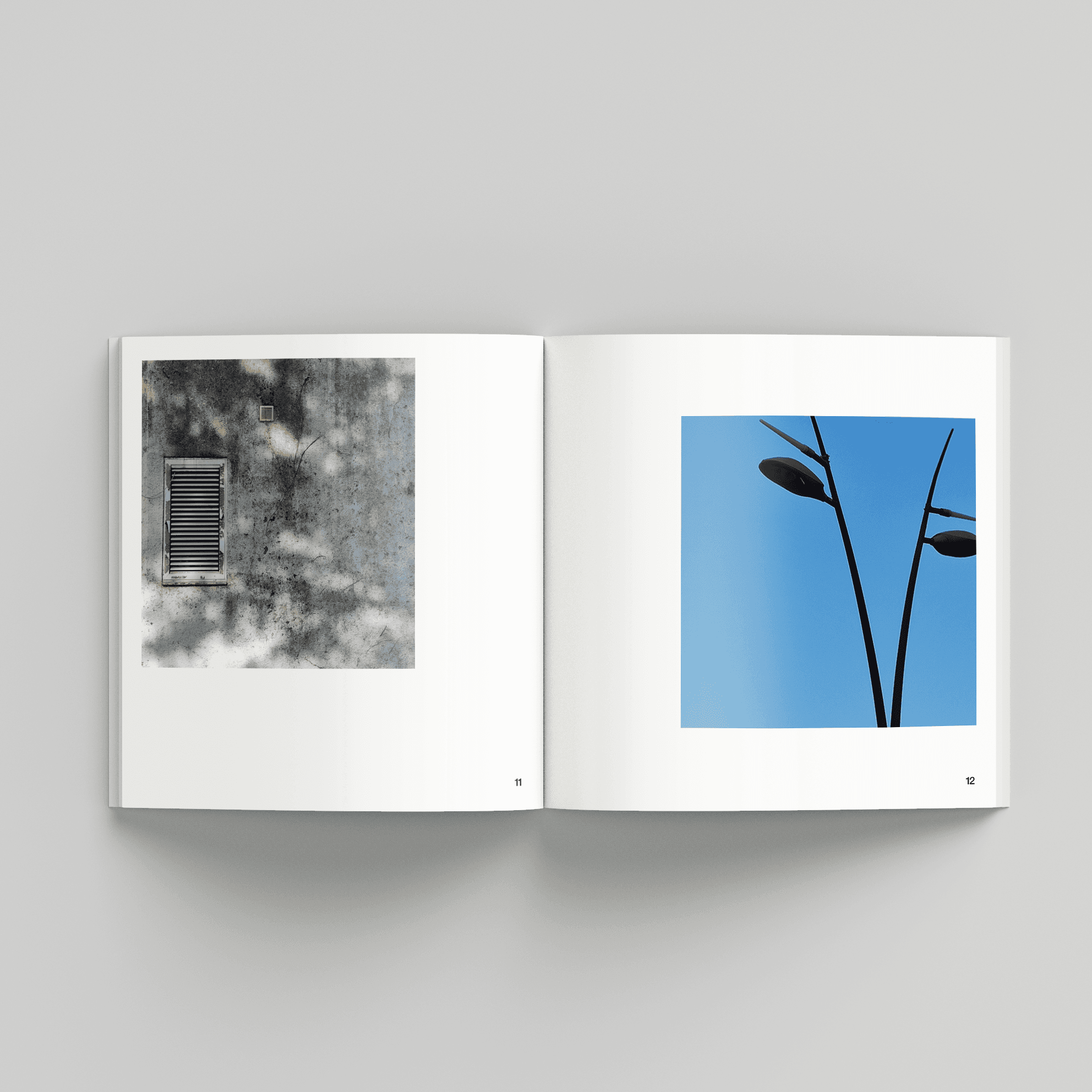
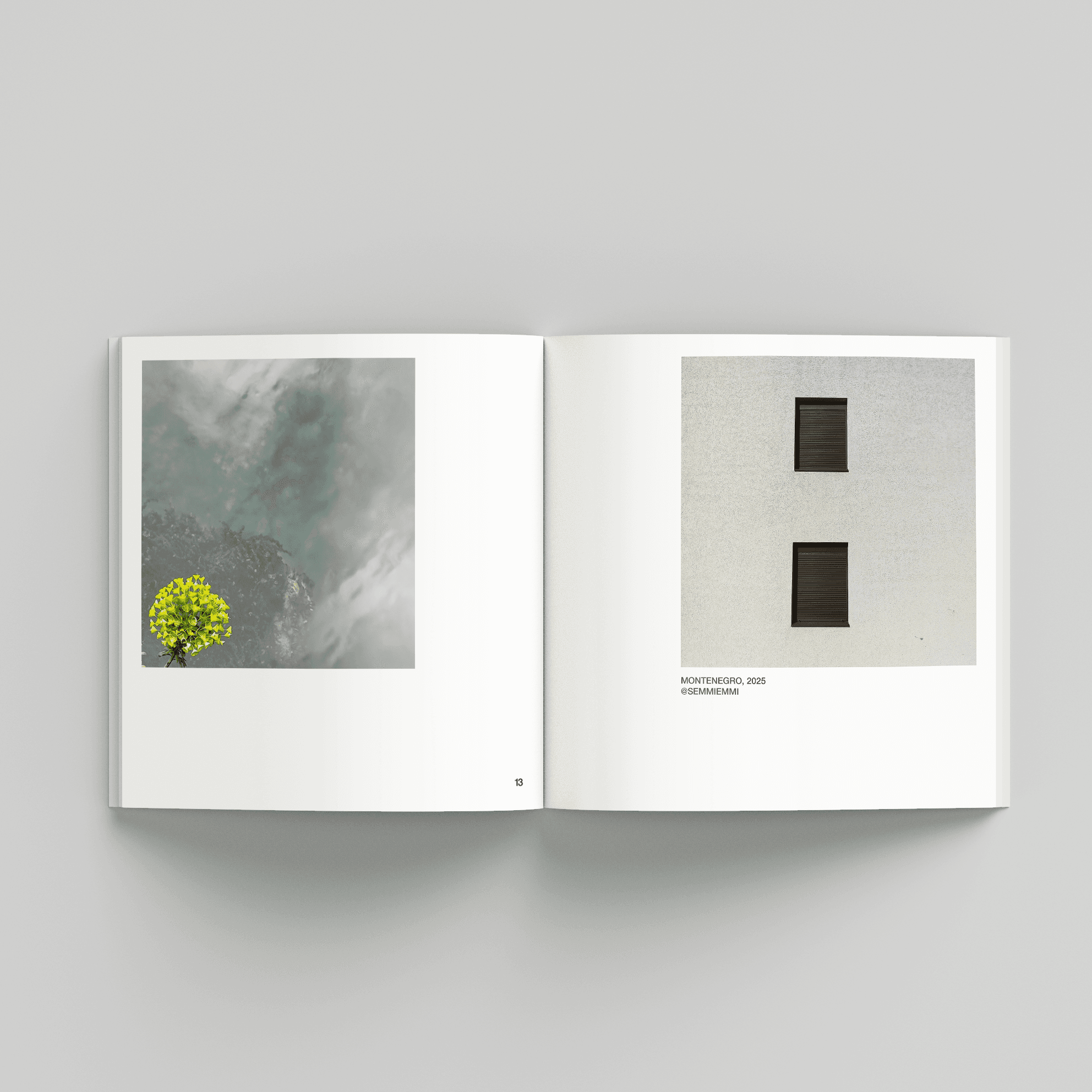
A minimal photo zine created in collaboration with my sister, who documented everyday fragments in urban Montenegro.
This project explores the unnoticed — small details, quiet textures, and strange objects that usually escape our attention. The goal was to give space and meaning to the overlooked.
I designed the layout to feel calm, clear, and structured. Each image sits in a white frame, supported by simple captions and generous negative space.
Square format, soft rhythm between full-page and paired spreads
Clean Swiss-style layout with subtle use of Helvetica Neue
Minimal typesetting to let the images lead
Printed mockup design for digital presentation
This project reflects my interest in quiet storytelling, typography, visual rhythm, and the poetic side of editorial design.
Share: